CSS linear-gradient() Function
The linear-gradient() function allows you to create a linear gradient using CSS.
CSS gradients allow you to apply multiple background colors to an element that blend from one color to the next. Like this:
To create a linear gradient, use the linear-gradient() function as a value to any property that accepts images (for example, background-image, background, or border-image properties). CSS gradients use these properties to build an image of the specified gradient.
Linear gradients are gradients that run in a straight line. This is in contrast to radial gradients which have a circular or elliptical shape.
Linear gradients can go in any direction — up, down, sideways, 45 degrees, 63 degrees, or any other angle you like.
Linear gradients are created by establishing an axis called the gradient line. Color stops are then placed along that gradient line to create a gradient that runs between each color.
How to set the Angle of a Linear Gradient
You can set the angle of the gradient line so that the gradient runs along that angle. You can specify this with an angle value (e.g. 45deg, 90deg, 180deg) or with one of the keywords for specifying the angle (such as to top, to bottom, to top left, etc).
Here's how gradient angles work.
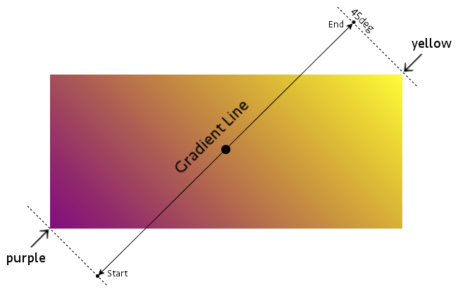
The gradient line runs perpendicular to the painted lines of the gradient. This gradient is on a 45 degree angle. Therefore the gradient line is -45 degrees (or 315 degrees).
The gradient line has a start point and an end point. The start and end points are located outside the box, however, they are located precisely where they need to be in order to have the pure color exactly at each corner (purple is exactly at the bottom left corner, and yellow is exactly at the top right corner).
Set the Angle using Degrees
Here's an example of specifying the angle in degrees:
Set the Angle by Keyword
Here's an example of using the to bottom right keyword:
Keywords can specify a side of the box (e.g. to top) or a corner (e.g. top top right. See Possible Values below for a full list of available keywords.
Default Angle
Setting an angle is optional. If you don't set one, it defaults to to bottom:
Color Stops
Color stops are the bit that tell the gradient which colors to use and where. You specify the color to use and (optionally) the position along the gradient line that it should be located at.
You can specify the color using any valid color value, and you can specify its position using either a percentage or length value.
Two Color Stops
The following example uses two color stops: red and yellow. These are written as red, yellow.
If you don't specify where the color stops go (like in this example), the first and last stops will be positioned at the 0% and 100% marks respectively. Any other stops will be positioned halfway between the previous stop and the next stop (unless you specify otherwise).
Three Color Stops
In this example we add a third color. Because we don't specify a position for any of the colors, they use the default position and spread evenly across the box:
Positioning the Color Stops
You can use as many colors as you wish, and you can place each one at a specific place along the gradient line.
Here's a similar example to the previous one, except, in this one we specify a position for each color stop:
By specifying a position, you affect how much of each color is used. You can effectively "squash" one color into a smaller area and expand another if you wish.
Sharp Color Stops
You can even set your color stops so that they go straight from one specified color to the next (i.e. there's no gradual blend between colors).
Like this:
Patterns with Gradients
You can take gradients to the next level and come up with some interesting patterns.
Here's an example:
Check out these CSS patterns if you're interested in this concept.
Official Syntax
The official syntax of the linear-gradient() function is as follows:
And here's the syntax for color stops:
Possible Values
As indicated in the official syntax, the linear-gradient() function accepts the following values:
- angle
Specifies an angle for the direction of the gradient. For example,
45deg.- side-or-corner
-
The following keywords specify a side to point the gradient line:
to top- Same as
0deg. to right- Same as
90deg. to bottom- Same as
180deg. to left- Same as
270deg.
-
The following keywords specify a corner to point the gradient line:
to top left- The gradient line is angled such that it points into the same quadrant as the top left corner, and a line drawn perpendicular to the gradient line through the center of the gradient box intersects the two neighboring corners.
to top right- The gradient line is angled such that it points into the same quadrant as the top right corner, and a line drawn perpendicular to the gradient line through the center of the gradient box intersects the two neighboring corners.
to bottom right- The gradient line is angled such that it points into the same quadrant as the bottom right corner, and a line drawn perpendicular to the gradient line through the center of the gradient box intersects the two neighboring corners.
to bottom left- The gradient line is angled such that it points into the same quadrant as the bottom left corner, and a line drawn perpendicular to the gradient line through the center of the gradient box intersects the two neighboring corners.
- color-stop
- A color stop is a color value, followed by an optional stop position. The stop position, if specified, can be provided in a percentage or length value.
CSS Specifications
- The
linear-gradient()function is defined in CSS Image Values and Replaced Content Module Level 3 (W3C Candidate Recommendation 17 April 2012) - It's also being further defined in CSS Image Values and Replaced Content Module Level 4 (Editor’s Draft)
Browser Support
The following table provided by Caniuse.com shows the level of browser support for this feature.