Flexbox Introduction
Flexbox is a layout model designed to help web authors create advanced website layouts that are difficult to achieve using other layout models.
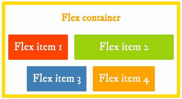
CSS flexbox (also referred to as flexible box) provides web authors with control over how elements are positioned, aligned, and sized within their container. It allows you to do things like, specify how elements are aligned vertically and horizontally, change their order of appearance, change the direction in which all elements are laid out, and more.
Prior to flexbox, common website layouts were often difficult to achieve, due to limitations in the existing layout models. The existing layout models didn't really cater for the complex web applications that are so common on the modern web. The block layout model was designed for document layout. The inline model was designed for text. The table layout model was designed for laying out 2D data in a tabular format. And positioned layout allowed very explicit positioning of an element without regard to other elements in the document.
Due to the limitations of these layout models, website layouts were often achieved using a combination of floated elements, positioned elements, and maybe even table layout. Getting a website to look right across various screen sizes was usually a headache. The only way to get a website to look right was to incorporate a bunch of hacks — that often seemed counter-intuitive — in both the CSS and the HTML code. This goes against the whole "separation of presentation and content" approach that any decent web developer strives for.
The CSS Flexible Box Layout Module was developed by the CSS Working Group to provide a box model that could overcome those issues. It became a W3C Candidate Recommendation on 26 May 2016, but has had widespread browser support since well before that date.
Flexbox Properties
Flexbox consists of various "flex" properties, as well as a whole bunch of alignment properties. As you'll see in this tutorial, alignment is a big part of flexbox. And now grid layout also uses most of the same alignment properties, so the W3C has separated the alignment properties from the flexbox module and moved them to their own "alignment" module — CSS Box Alignment Module Level 3.
Basically, the flexbox properties define how flex items are sized, how they wrap, and which direction they go in. The alignment properties define how the flex items are aligned, both horizontally and vertically, within their container.
We cover most of these properties in this tutorial.